A South Korean digital asset exchange that blends decentralized and centralized systems to deliver a seamless trading experience. I contributed by designing their landing page, web interface, mobile app UI, and social media visuals, ensuring a cohesive and user-friendly digital presence.
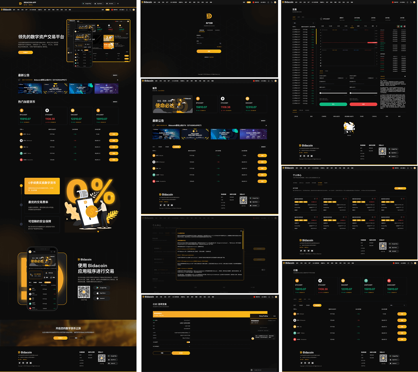
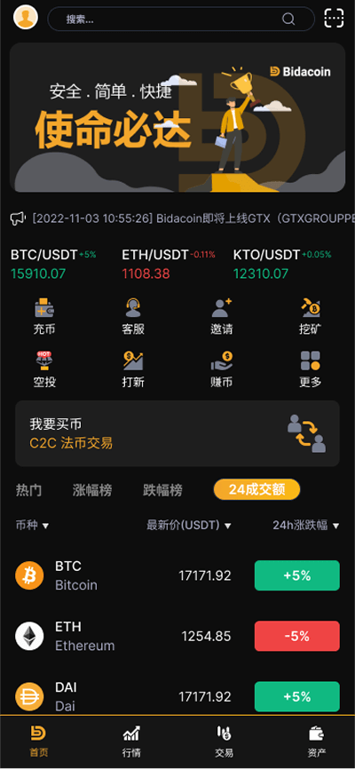
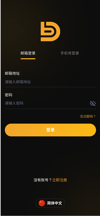
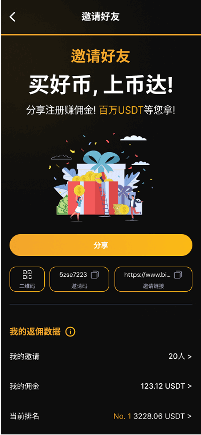
Designed the landing page, web platform, and mobile app UI for Bidacoin
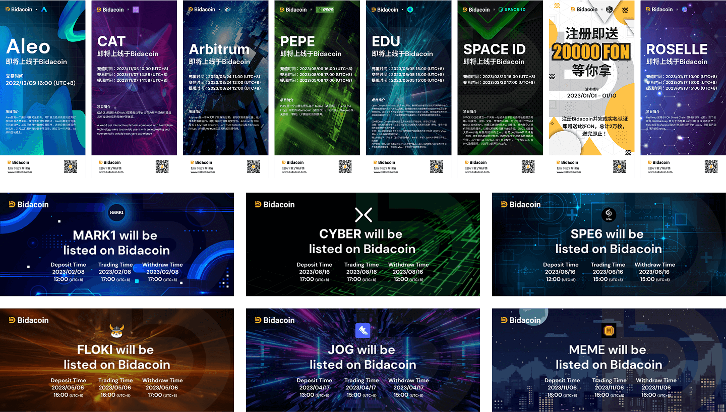
Delivered visuals for social media marketing, to appeal to both crypto-savvy and new users
Focused on aligning complex financial features with a sleek, intuitive interface
Target Audience
Primary Users & End-Users: Cryptocurrency traders, investors, and financial enthusiasts
Behavior & Pain Points:
Users engage with multiple trading platforms; expect high usability and performance
They often distrust overly complex or cluttered UI
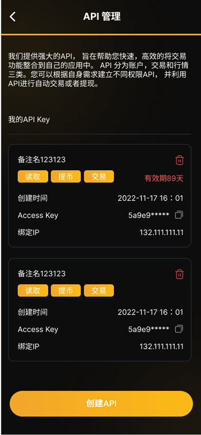
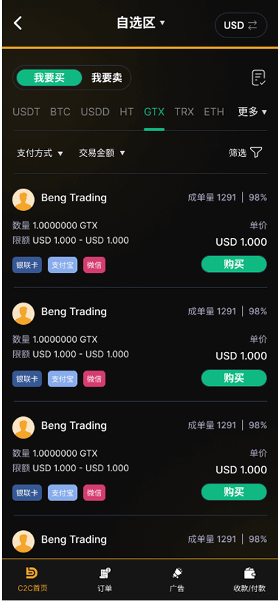
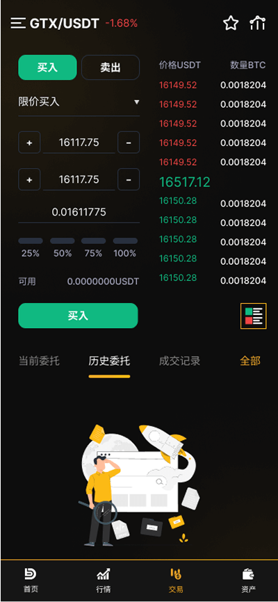
Require quick access to real-time data, wallet features, and trading functionalities
Frustration arises from poorly optimized mobile UX or generic visual identity
Goals & Challenges
Goals:
Create a strong visual identity for a trading platform & graphic visual
Build user trust through a sleek and professional design
Deliver an intuitive experience across desktop and mobile platforms
Challenges:
Presenting complex features in a beginner-friendly interface
Balancing tech-heavy data with visual clarity
Designing for a competitive and fast-evolving Web3 landscape
Key UX Decisions
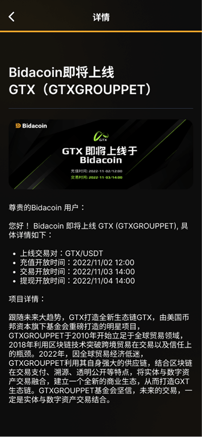
Users often arrive at the platform looking to explore new trading opportunities or access decentralized finance tools. Bidacoin aimed to differentiate itself by offering a hybrid model that combined centralized and decentralized features. To support this, I designed a clear onboarding flow that introduced the platform’s unique benefits, followed by streamlined navigation to the wallet, trading dashboard, and portfolio sections.
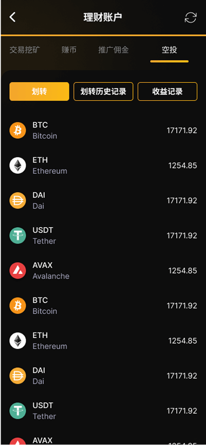
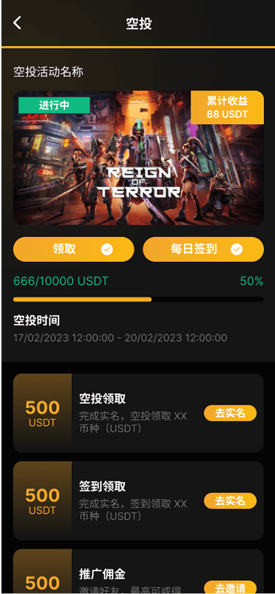
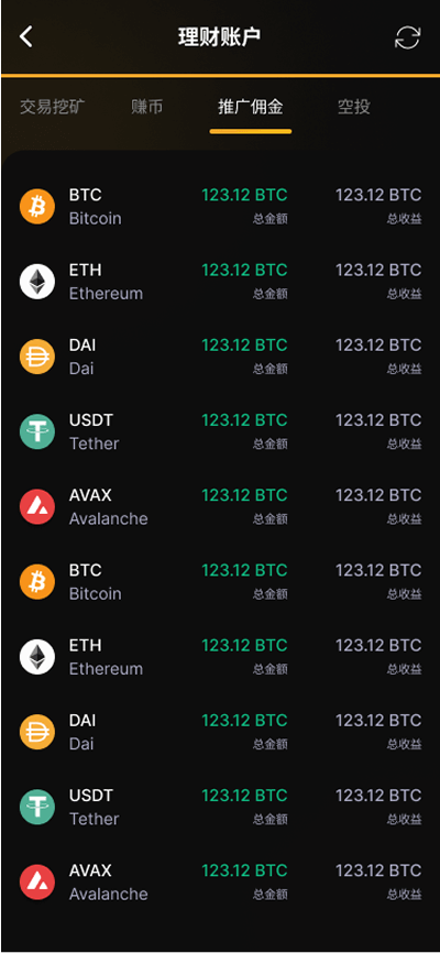
The landing page served as the first impression, emphasizing credibility and security. Key UX decisions included simplifying the information architecture, grouping high-value actions (like trade and wallet access) visibly, and optimizing the layout for performance on both web and mobile. For the mobile app, I focused on prioritizing real-time data visualization, easy asset tracking, and finger-friendly navigation.
Research Summary
I conducted a visual and UX analysis of competitors such as Binance, Huobi, and Crypto.com. Each platform varied in tone—from highly technical to lifestyle-oriented—but successful platforms shared common threads: strong branding, focused CTAs, and clean UI that made complex tools feel accessible. This research reinforced the need for Bidacoin to balance professionalism with simplicity, especially when targeting emerging markets and new users.
Design Approach
Created a dark-themed interface with orange (BIDACOIN Color) highlights to convey a futuristic, secure vibe
Designed component-based UI patterns that could scale across both web and mobile
Introduced iconography and infographics to simplify complex actions
Applied Web3 design aesthetics—minimalist, bold typography, and dynamic gradients
Impact / Outcome
Helped establish a clear, modern brand identity in a competitive fintech space
Improved onboarding experience and feature discoverability
Supported the launch of web and mobile apps with consistent design language
Future Recommendations:
Expand to multilingual support with culturally tuned UI variations
Add motion micro-interactions for feedback on critical actions like trades or swaps